Hackathon
Role
Experience Designer
Duration
12 hours
Tools
Adobe XD, Photoshop, Illustrator
―
Logo by Alexis
From the lead developer:
“Alexis' UX knowledge produced an elegant, clean, and minimal design workable for low-bandwidth systems to ensure accessibility to underprivileged populations. As a lead developer on the team, this made front-end design a painless process that gave plenty of time to design a highly-functional back-end. Her calm leadership, open mind, and consummate professionalism made her a pleasure to work with.”
- Michael Dudley-Marquez
Objective
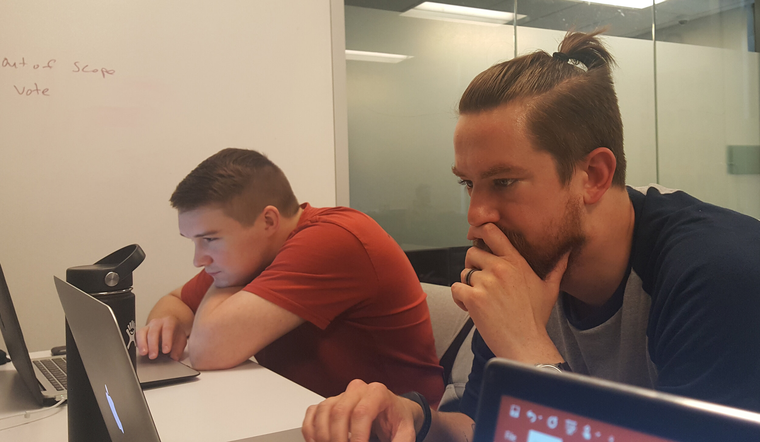
The theme was homes. Teams were grouped into three developers and two UX designers. With the theme being as broad as it was, our team immediately dove into collaborative ideation.
Problem
Resources provided by donation centers, volunteer work, and popup services can go unnoticed simply because those in need have no way of knowing when and where they are happening.
Concept
Our app enables the homeless to find local resources near them, within four categories: health, food, shelter, clothing.
Design Question
"How might we provide the homeless with a way to be more aware of local resources and aid in real time?”
Hypothesis
Designing an app that broadcasts details about local resources and aid will enable those in need to be apprised of help in real time. This will be true when resources are more frequently used.
Need & Viability
I quickly gathered data through online searches to inform the UI design and to understand the level of viability this app would have.
Surprisingly, over half of homeless youth owned a smart phone - enabling them access to apps.
Source: 2018 Annual Homeless Assessment Report by the Department of Housing and Urban Development (HUD).
The Collab
Given the time constraints it was key to give the developers tasks to work on while the UX designers embarked on the sketches and wireframes. Once the basic concept sketches were complete, I quickly created the app icons and relayed the sketches so the developers were able to being work.
Sketches
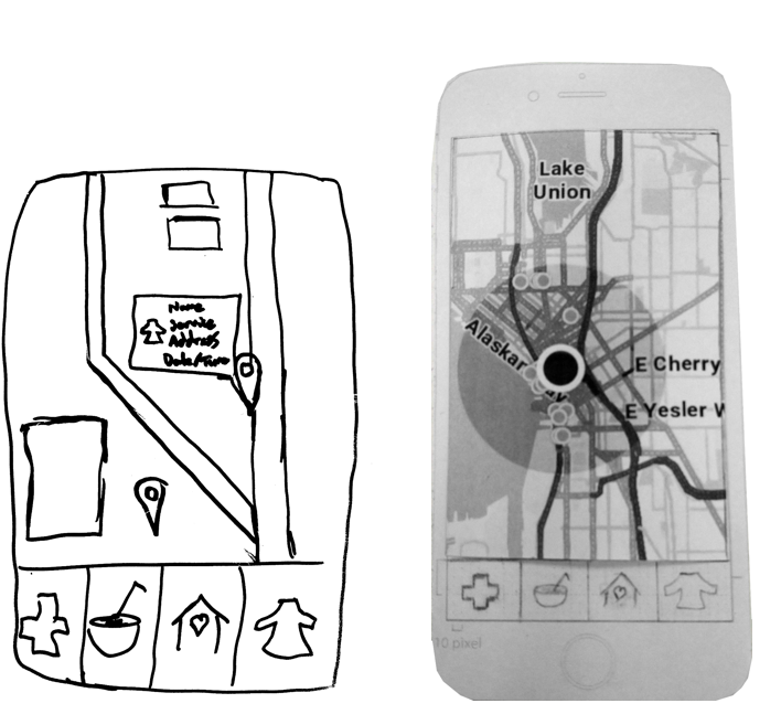
Sketches created by Victor Ng.
I collaborated with the other UX designer to begin ideation on the UI. There were a few considerations that informed our design.
Users may be in a location with low signal, or have older phones. The app must be minimal and not require a lot of bandwidth. The developers implemented React to reduce loading time.
To save space and provide clarity for users who may not speak English, icons were a must.
Using design patterns users are familiar with will reduce confusion and improve usability.
User Testing & Iterations
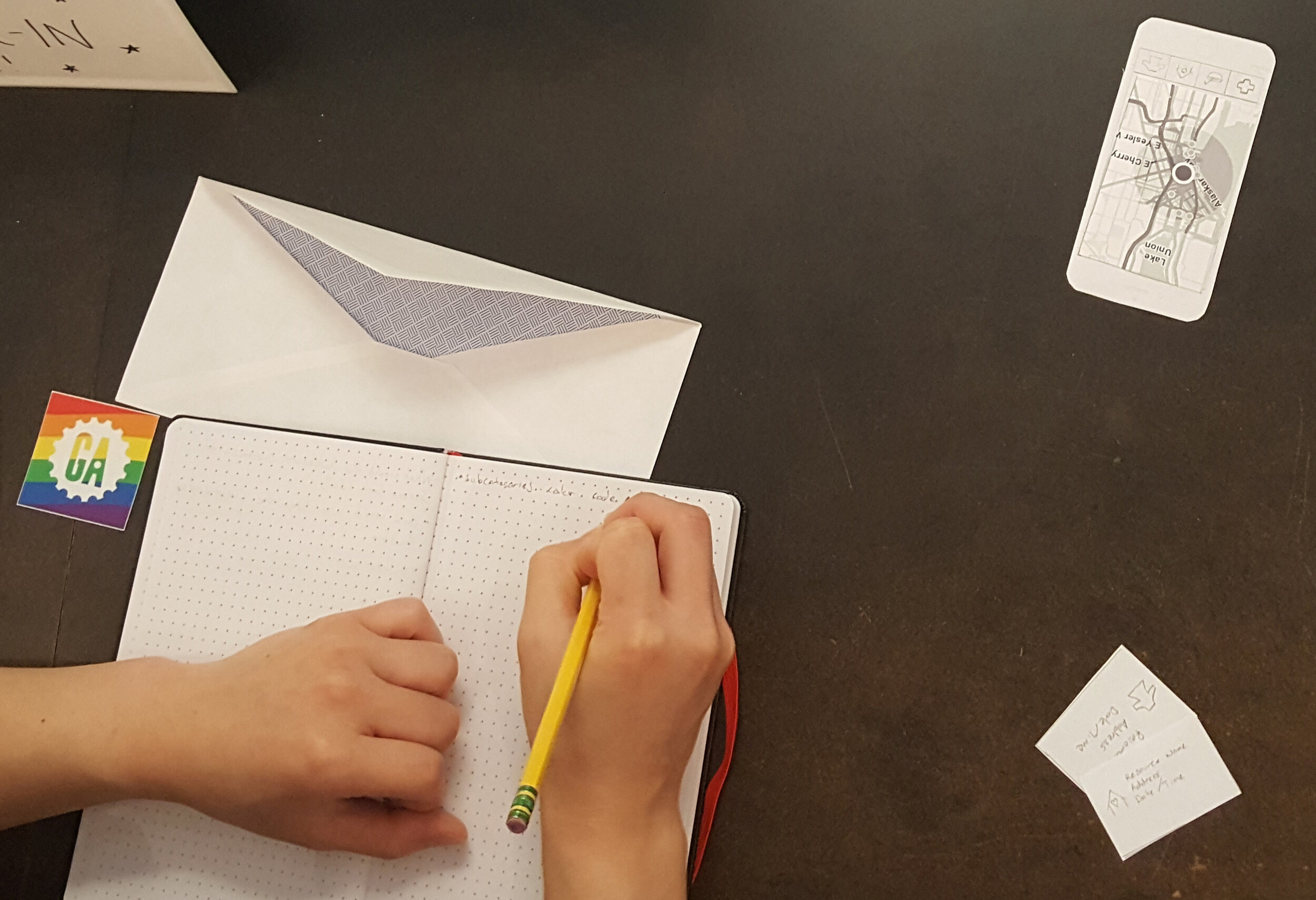
The paper prototype was tested with seven users before handing off the final UI to developers. From the testing, two iterations were implemented.
The icons had minor tweaks to simplify them and make them more easily recognized.
Users expressed the need to see when a button was engaged. Turning the category button grey allowed users to easily recognize what page they were on in the app.
Prototype & Feedback
My team presented a live demo of our final prototype. The other UX designer and I conducted a survey with a 4-point Likert scale.
Next Steps
If I was personally given more time to move into the next phase, I would prioritize the following. To make this app fully functional, resource entry would have to be integrated so those who are providing the aid are able to add it to the map. Search and filter functionality would help users get more specific about what kind of help they need beyond the broad categories offered. And lastly, giving users the ability to vote resource sites up or down would boost validity, trust, and credibility.
Takeaways
The time limitations and scope required swift action while defining clear roles and maintaining consistent communication. As a UX designer it was pertinent to understand the feasibility of my ideas in the time allotted from a development standpoint. Equally important when working with developers - understand what they need and at what time to complete the project on time. Breaking tasks down into phases was helpful; this structure created mini milestones to build momentum.


