The Stranger
Role
Experience Designer
Duration
2 weeks
Tools
Adobe Creative Cloud
―
Formed in 1991, The Stranger is best known in its print newspaper form, found for free on many streets in Seattle. They also have a website and blog, along with an app, “Stranger Things To Do” that holds upcoming events in Seattle.
Objective
Redesign the Stranger Things to Do App with the objective of solving for issues raised in the user reviews, primarily improving the navigation and event searchability.
Problem
The Stranger needs an intuitive event app that delivers fresh, updated local events on a daily basis. The app requires functionality that enables easy searchability and crystal-clear navigation. Currently the app’s navigation lives at the very bottom of the page and is often overlooked. In addition, most users find it frustrating to download the app only to find that it routes them back to The Stranger website, making the app obsolete.
Design Question
"How might we provide value that sets the Stranger app apart from larger event platforms, ultimately incentivizing downloads and consistent use?”
Hypothesis
Addressing the persona’s pain points and needs through an app redesign will enable her to easily find and save events of interest in a seamless experience. This will prove to be true once there is an increase in app downloads, ratings, and consistent use.
Research Insights
Preliminary research found that the app rating was low (2.4 out of 5) for two primary reasons: the app routes to The Stranger website, and the searchability is unintuitive.
User Interviews gathered the following key insights & trends:
While users want the ability to browse by category, they use the search function frequently - and need it overtly accessible no matter where they are in the app experience.
Users have a need for simplicity yet the ability to quickly access more information as desired.
Users want the ability to filter when using search for an event.
The Persona
Site map
The original app routes the user to the Stranger website in most cases, rendering it a superfluous use of the user’s device bandwidth.
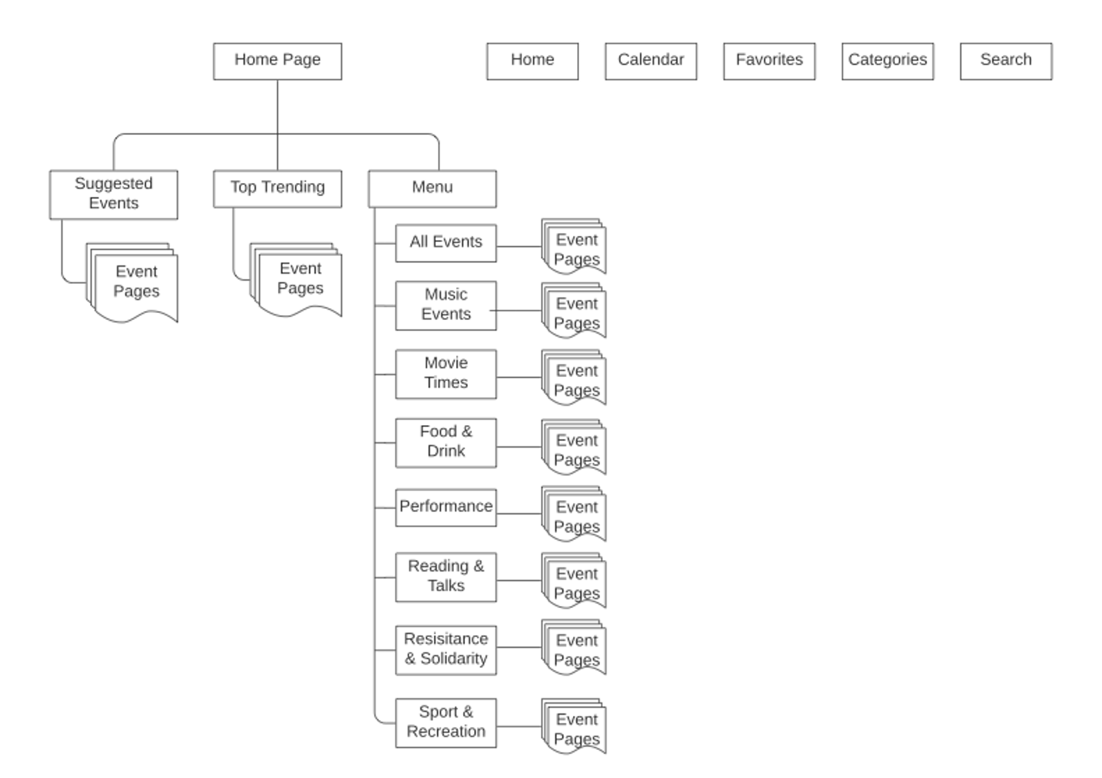
Site map created by Victoria Hunter.
Site map created by Victoria Hunter.
The redesigned site map designates a page for each event, at no point routing to the website.
Feature Prioritization
In effort to move the needle while maintaining adherence to the project scope, I prioritized features based on Isabella’s key pain points.
An in-app experience: As reiterated in the app reviews and user research, an in-app experience was critical.
Searchability: Isabella needs the search function to be clearly visible and easy to filter.
Consistent navigation: Isabella typically searches for events on her iOS mobile device. The iOS style navigation must be intuitive, simple and consistent so she is able to quickly find what she’s looking for.
Ideation & Sketches
I began the ideation phase focusing on Isabella's needs and pain points, as outlined in the feature prioritization. I aligned with the design style of Isabella’s primary device (iPhone) as well as the patterns of apps she uses currently (EventBrite, Facebook).
The Prototype
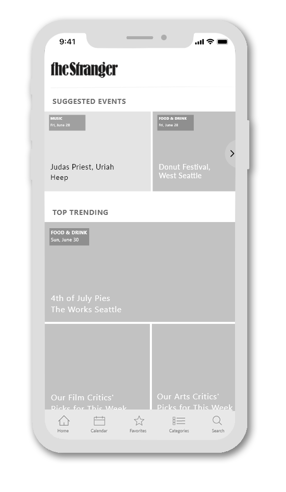
I kept the app’s home page similar to the current layout, featuring suggested events based on recent views and RSVPs as well as top trending events in the area.
The primary difference in the redesign is the bottom navigation, which allows the user to easily find events through three separate task flows.
Home —> Categories —> Category —> Results —> Event
Home —> Search —> Results —> Event
Home —> Calendar —> Date selection —> Results —> Event
User Testing & Iterations
The prototype underwent three rounds of user testing.
15 users were assigned tasks that tested three separate flows to an event page - using the categories, search, and calendar functions.
The Logo
From the get-go users were commenting on the app logo. It was tongue-and-cheek, but an important piece of feedback nonetheless.
"Ha! So this isn't an app for the Stranger Things show?"
Feedback: The logo could be misinterpreted.
Iteration: To simplify I used The Stranger logo only.
The Menu
Previously, the only way a user could browse or find an event was to scroll to the bottom of the page—typically taking a good four swipes. With that, I initially brought the categories menu to the top right of the screen in an ellipsis, for immediate visibility.
“I didn’t notice the ellipsis, and even if I did it would not be clear as to what that would lead me to.”
Feedback: The ellipsis wasn’t immediately obvious, nor clear to users.
Iteration: I added the categories button to the main navigation, and created a separate page that lists the categories as opposed to a dropdown from the top. The final round of testing proved this was the most intuitive placement.
The Event Page
Quick digestion; no chewing required
When Isabella is checking out events, she doesn’t want to eat up time. She wants the information immediately - at a glance. User testing results reinforced this need. Key information needed to be above the, “fold,” and easy to read - or not read. Users expressed the need for an image at the top of the page so they could get a feel for the event’s vibe in a millisecond.
“Sometimes I’m in too much of a hurry to stop and read. I prefer pictures.”
Feedback: Users wanted to be able to quickly digest event information - without reading much at all.
Iteration: I added space for an event image and price at the top of the page, and simplified the bottom options into icons (save event, view on map, share, etc.) Not only was this easy to digest, but universally understood across languages.
Information at the fingertips
In precise alignment with Isabella’s needs, most users complained about the superfluous scrolling required to view the event information.
“My fingers hurt from all the scrolling, I mean not really but, really. Too much scrolling to get all the details.”
Feedback: Too much scrolling, important details were too far down on the page.
Iteration: I added a, “show more,” and, “show less” option for users who want more in-depth detail about the event. This not only simplified the page aesthetic, it saved valuable page real estate for the icons to be in view without scrolling.
Tell me something I don’t know
Eleven out of the sixteen interviewed primarily used Facebook and/or Eventbrite. While many testers appreciated unique event details such as accessibility, parking availability etc., many expressed that this app could be duplicative to these larger platforms. When asked what other details they would want in this app, many brought up venue.
“I usually look up the venue manually, especially for the smaller events, just so I can mentally get an idea of how it might be. It’s be nice to have that available.”
Feedback: Offering information about the venue would help set the app apart from the larger platforms and further justify use.
Iteration: To maintain the simplicity and readily available information, I added a venue icon to the group. When tapped the user is taken to a page for the event venue that provides images, ratings and in-depth details. Because this is an app for the Seattle area only, it would be reasonably feasible to include specifics such as venue details, images, ratings etc.
Next Steps
During the last round of user testing much of the feedback we received was outside of our scope. Had there been more time for this project we would add a few more features:
Account creation
Subcategories such as music sorted by genre
Past events reviews and gallery
Cancelled or changed event alert
More specific filters & metatags
Takeaways
Allotting adequate time for thorough user research is foundational. Interviewing an array and sizeable user base is important to gather comprehensive data that informs the app’s design.
Don’t allow personal opinions to impact research interpretations.
I was similar to the persona; it was important to be cognizant of this while making design decisions.Iterate, iterate, iterate.
There may be feedback in user testing that changes much of the design, so having space for this is important before finalizing the product.


