Shanghai Garden
Role
Experience Designer
Duration
2 weeks
Tools
Adobe XD; Illustrator
―
Chef Su and his wife opened the restaurant in 1990. Cooking since the age of sixteen, Chef Su strives to bring Chinese food to another level through unique, authentic and nutritious dishes served in a restaurant with a welcoming touch.
Objective
Redesign the Shanghai Garden website.
Problem
Shanghai Garden brings an authentic and nutritious angle to Chinese food, yet it is often overlooked because customers are unable to place intuitive, efficient orders through their website.
Design Question
"How might we enable Shanghai Garden to stand out from the competition and increase their customer base? ”
Hypothesis
Building this intuitive, efficient, yet unique online ordering experience that consumers like Lauren Berlinger seek will enable Shanghai Garden to transform their ordering process and ultimately increase their customer base.
The Persona
For this project the persona was pre-assigned, enabling me to focus on the design instead of research.
Ideation & Sketches
During the sketching phase I played with different layouts according to what Lauren would find most appealing, unique, and efficient. Based on Lauren’s pain points and needs, the online ordering process must be easy yet elegant, featuring beautiful dish imagery and crystal-clear descriptions.
Sitemap
Shanghai Garden is currently a one-page website. Which, on its own is not a terrible thing, however combined with low quality images (menu) and ads the site is unintuitive to navigate.
The menu is extensive. It has an array of dish types, styles and options; warranting a designated menu page.
Wireframes & Prototype
Home
One of Lauren’s pain points is an unintuitive and cluttered UI. She favors beautiful, large photos and an exceptionally straight forward experience.
On the home page I added a large banner where featured dishes span across the page (1). Lauren is an edgy scriptwriter; she appreciates witty text that adds character to the brand. The banner text provides an opportunity for integrating brand personality (2). Large icons support the UI simplicity and visually balance page (3).
Order Online
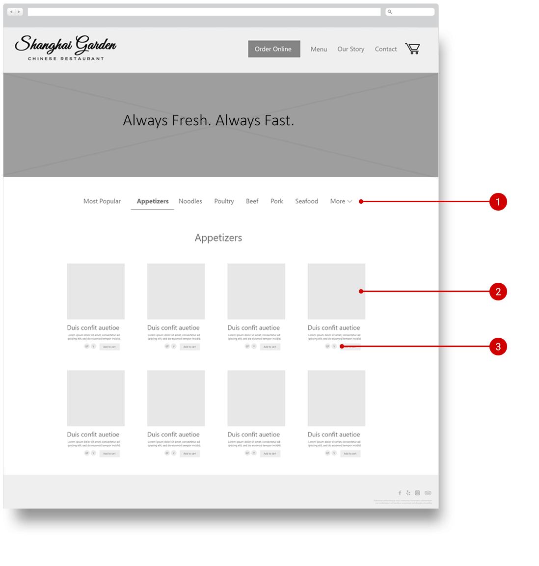
Shanghai Garden has an extensive menu that can quickly become overwhelming. Instead of creating a long list of menu options that would require far too much scrolling, I created a category list across the top of the page (1).
As an additional challenge, the menu has many dish categories — more than can fit horizontally across the page. Here I leveraged Miller’s Law, showing no more than seven categories with a “more” dropdown. This is less overwhelming, aligns with design patters Lauren is used to, and satisfies her need for ample of information without overwhelm.
Large images help Lauren decide which dishes to select (2).
To provide Lauren with ample product options without cluttering the UI, I added icons for diet preferences such as vegan, gluten free etc. (3).
User Testing & Iterations
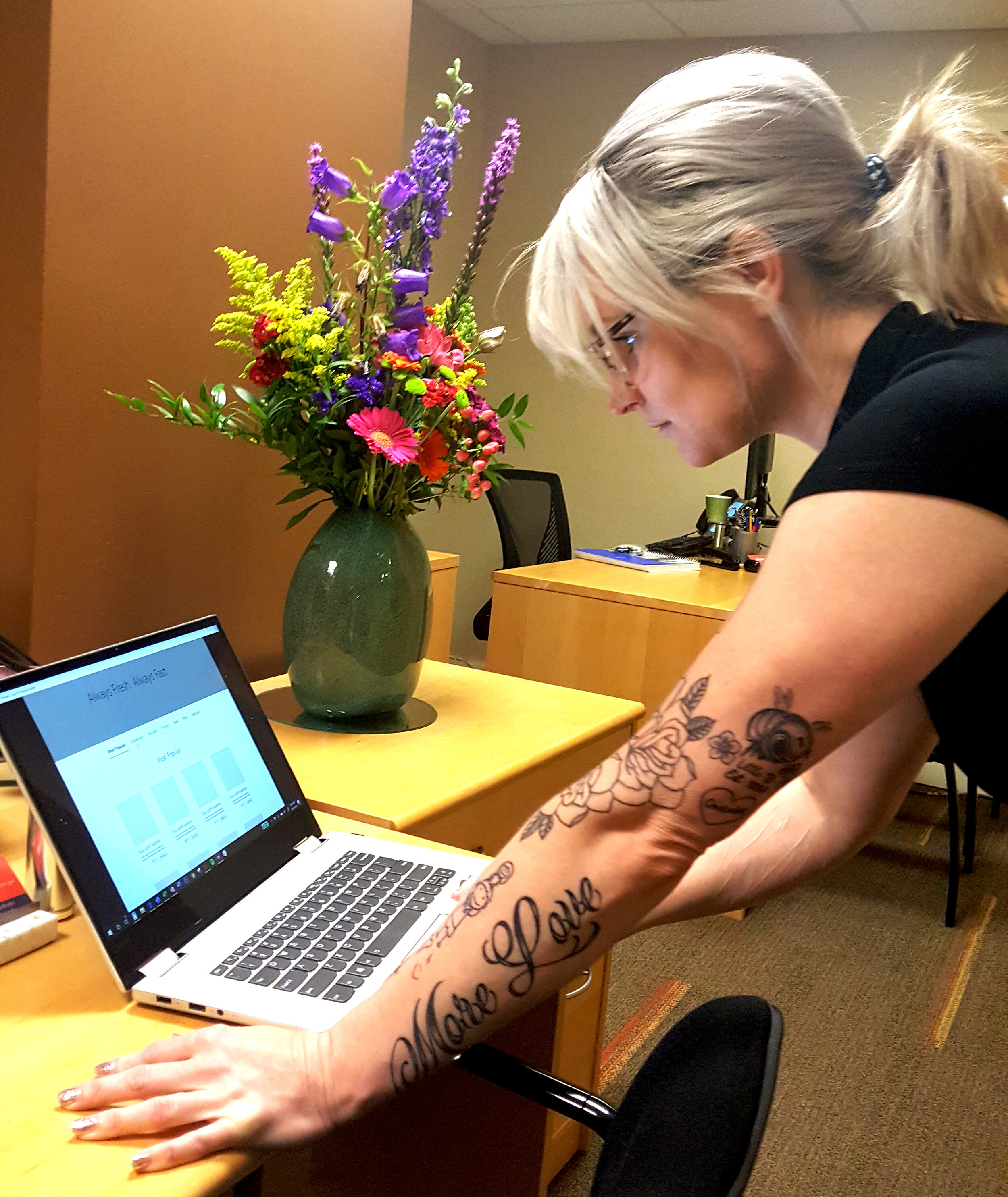
Testers were asked to perform three scenarios created for my persona.
Once complete, users shared specific areas of confusion. The designs were iterated in response to user feedback.
The Navigation
While I housed the order online button within a faint box, users did not immediately see the order online button.
“The order online button wasn’t that obvious to me.”
Iteration: Darken the, ‘order online’ button and inverse the text make it more prominent.
The Shopping Cart
Lauren appreciates brand personality, so I added a Chinese takeout box as a cart icon. This was surprisingly confusing to users.
“I didn't know what that icon meant, if I saw a basket I'd get it.”
Iteration: Change Chinese takeout box icon to a shopping cart so it is more universally recognized.
Next Steps
During the last round of user testing much of the feedback received was outside scope. Had there been more time for this project I would add the following features based on Lauren’s needs:
Account creation
Custom order options
Instagram feed
Takeaways
A big learning from this project - you can’t win them all. Lauren has many needs and pain points. As the design initiates it is nearly impossible to satisfy all user needs from the research. During this project I found myself wanting to make design decisions that almost contradicted one another, it became imperative to maintain focus on what needs/features I was addressing.


